Navigation Zones One Handed
Map out the reachable zones on a smartphone screen. Learn where to place buttons, menus, and navigation for comfortable one-handed interaction during rush hour.
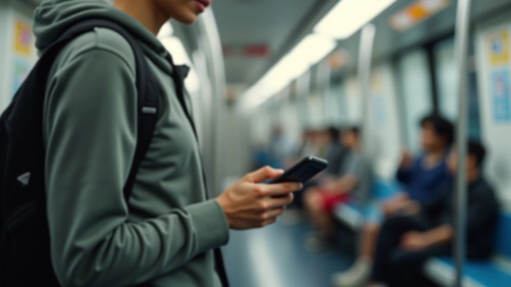
Singapore’s MRT is packed during rush hour. You’re holding onto a pole with one hand, checking your phone with the other. Navigation buttons at the top of the screen? Unreachable. That’s the reality for millions of commuters here. We’re not designing for people sitting at desks — we’re designing for thumbs on moving trains.
Understanding thumb reach zones isn’t just nice design. It’s the difference between a usable app and one people delete after a week. When you get this right, everything else becomes easier.
The Challenge
Modern phones are big. A 6-inch screen means the top is almost impossible to reach with one hand. But users don’t hold their phones differently — we need to design around how they actually use devices.
Understanding Thumb Reach Zones
Think of your phone screen as divided into three horizontal bands. Each band has different accessibility when holding with one hand.
Dead Zone (Top 25%)
Unreachable without shifting your grip. This is where back buttons, menus, and navigation headers typically live. Don’t put critical actions here.
Comfort Zone (Middle 50%)
Sweet spot for your thumb. Natural reach without strain. Primary navigation, buttons, and interactive elements belong here. This is where users expect to tap.
Extended Reach (Bottom 25%)
Requires slight stretching but doable. Secondary actions and less-critical buttons work here. Bottom navigation bars fit naturally in this zone.
Practical Placement Strategies
You’ve got about 44-48 pixels of vertical space in the comfort zone where your thumb naturally rests. That’s roughly where the bottom third of a standard 6-inch phone sits. Smart designers use this real estate ruthlessly.
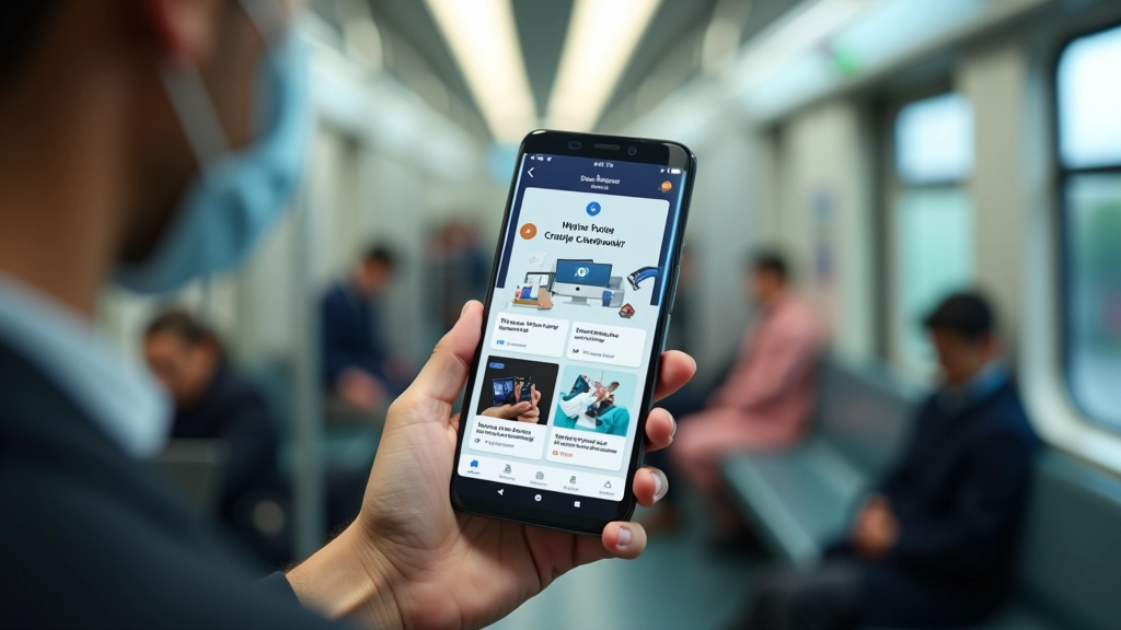
Back buttons? Move them to the bottom corners. Navigation tabs? Put them at the bottom. Primary actions like “Send” or “Confirm”? Bottom 25% of the screen. The pattern repeats across Singapore’s most-used apps, and there’s a reason why.
Pro Tip: Test your layouts on a real device while standing on the MRT. Holding a pole changes everything. If you can’t comfortably tap your main buttons one-handed while gripping a pole, redesign it.
Button Size & Spacing Matters
A 4444 pixel button sounds small. On paper it is. But on a phone screen, it’s actually the minimum comfortable size for a finger. Anything smaller and you’re fighting against human biology. Cramming buttons together? Users tap the wrong one every time.
In Singapore’s crowded trains, precision goes out the window. Someone bumps you, the train lurches, your thumb drifts. You need enough space between buttons that a mistake doesn’t activate the wrong action. At least 8 pixels of gap between buttons. More is better.
That’s not just design preference — that’s usability. Apps that ignore this get one-star reviews from frustrated commuters.
Real-World Examples from Singapore Apps
The best local apps get this instinctively. Grab’s interface puts your destination and booking button at the bottom. GrabFood positions your cart and checkout at thumb height. Singtel’s MyIDA puts account actions in the comfort zone. It’s not accident — it’s deliberate design for how Singaporeans actually use phones.
Navigation Pattern
Bottom tabs for main sections. Users don’t have to reach the top. Secondary menus can hide in a drawer until needed. This keeps the interface clean and thumb-accessible.
Modal Windows
When modals appear, close button goes bottom right. Action buttons go in the comfort zone. Users shouldn’t struggle with a modal that appeared to confirm something important.
Search & Filters
Search bar at the top is fine — it’s static and people know to look there. But filters and sorting options? Put those in the comfort zone where users can actually interact with them.
Testing Your Design in Real Conditions
Mockups on your desktop are misleading. Grab your phone. Stand up. Try using your app one-handed. Can you reach everything? Are buttons where your thumb naturally falls?
Better yet, test on the MRT during evening rush hour. That’s the real user environment. People bumping past you, the train rocking, your attention split between the phone and not missing your stop. If your interface works there, it works.
You’ll quickly find problems that analytics never show. A button you thought was in the right spot? Actually uncomfortable. A gesture that seemed obvious? Nobody does it. Real-world testing beats design theory every time.
The Bottom Line
Mobile-first design in Singapore isn’t abstract — it’s concrete. Users have one hand free. Buttons need to be where thumbs reach. Spacing matters. Real testing matters most.
You’re not designing for ideal conditions. You’re designing for 6 PM on the Circle Line with your free hand holding a pole. Get the zones right, respect the reach limitations, and your app becomes part of people’s daily routine. Ignore it, and they’ll switch to something better.
That’s the difference between an app that works and one that’s genuinely used.

Marcus Chua
Senior Mobile Experience Designer
Senior mobile experience designer with 12 years crafting thumb-friendly interfaces for Singapore’s urban commuters and Southeast Asian users.
Educational Information
This article provides educational information about mobile interface design principles and user experience best practices. The concepts and techniques described are based on established UX research and design standards. Every user’s needs and device capabilities vary, so these guidelines should be adapted to your specific context and user testing. Always validate design decisions with real users and actual devices rather than relying solely on theoretical frameworks.
Related Articles
Why Mobile-First Design Matters in Singapore’s Urban Context
Singapore’s rapid transit culture demands interfaces optimized for quick browsing between stations and during commutes.
Touch Target Sizing: The 44-Pixel Standard Explained
Why 4444 pixels isn’t arbitrary. We break down the science behind comfortable touch interactions.
Mobile First Singapore/Content Scanning Commutes
Structuring content into short digestible cards for quick scanning on moving trains and busy streets.