
Why Mobile-First Design Matters in Singapore’s Urban Context
Singapore’s rapid transit culture demands interfaces optimized for quick browsing. We explore how mobile-first thinking shapes better digital experiences for everyone.
Read MoreEfficient interfaces built for MRT commuters and urban browsing on the go
Position critical navigation elements within comfortable reach of your thumb during one-handed use. Bottom navigation bars and lower-third buttons keep interactions accessible during rush hour commutes.
All interactive elements meet minimum 4444 pixels for comfortable tapping. Generous spacing between buttons prevents accidental clicks on crowded trains. Fast feedback confirms user actions immediately.
Short paragraphs, scannable headlines, and visual breaks help users absorb information in seconds. Each card stands alone so users can understand content without scrolling between sections.
Singapore’s rapid transit culture demands interfaces optimized for quick browsing. We explore how mobile-first thinking shapes better digital experiences for everyone.
Read More
Why 4444 pixels isn’t arbitrary. We break down the science behind comfortable touch targets and how spacing affects accuracy on moving vehicles.
Read More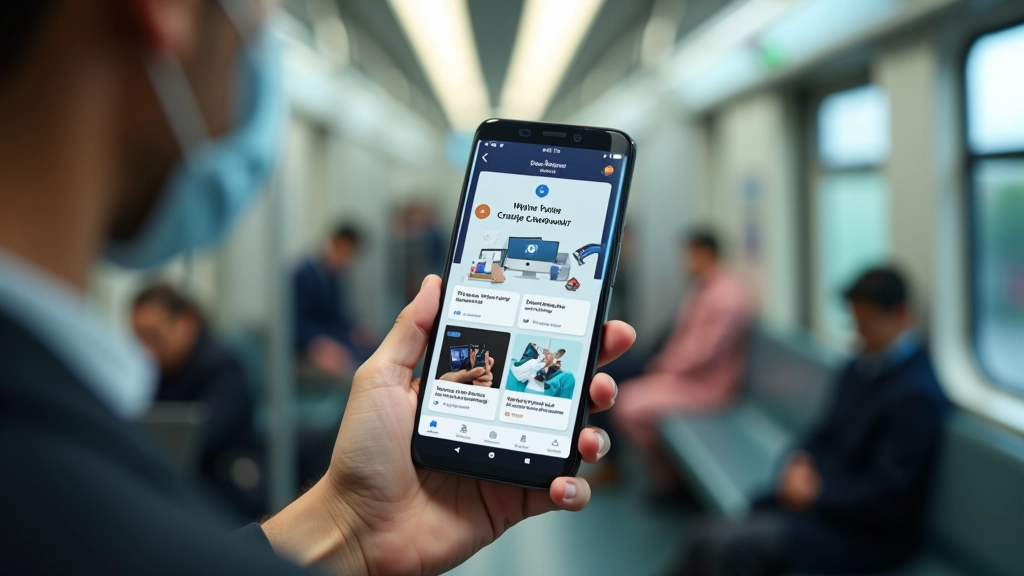
Card-based layouts, short paragraphs, and visual hierarchy make information digestible in seconds. Design patterns that work when you’re standing with one hand.
Read More
Map out the reachable zones on a smartphone screen. Learn where to place buttons, menus, and navigation for comfortable one-handed interaction during rush hour.
Read MoreMost browsing happens during 15-30 minute rides. Standing passengers have limited screen time. Interfaces must deliver value quickly without requiring sustained attention or both hands.
Singapore’s bright outdoor environment requires high contrast designs. Text and buttons must be readable in direct sunlight without straining eyes or increasing screen brightness.
Signal strength fluctuates in transit tunnels and crowded areas. Design for slow connections with efficient image sizes, offline capabilities, and progressive loading strategies.
Crowded trains mean accidental brushes against screens. Adequate spacing, confirmation dialogs for critical actions, and edge-safe navigation prevent unintended interactions.