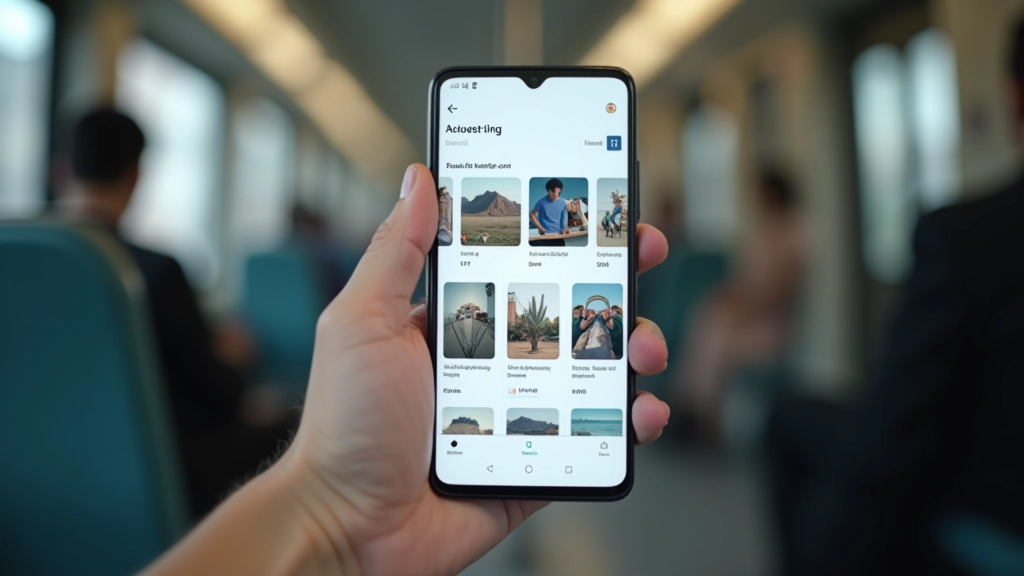
Card-Based Design: Breaking Content Into Digestible Units
Card layouts aren’t trendy — they’re practical. When you stack information into distinct visual units, users can absorb it in chunks. Each card becomes a scannable bite-sized piece that doesn’t require commitment. On a crowded train, someone can glance at a card, get the essential information, and decide in 3 seconds whether they want to tap for more.
Best Practice
Limit card text to 2-3 lines maximum. If you need more, that’s a signal to split the content across multiple cards or move details to a separate page.
The magic happens when you combine cards with clear visual hierarchy. A headline, supporting text, and maybe an image — that’s the sweet spot. We’ve tested this extensively with Singapore-based users, and the data’s consistent. Cards with images get 40% more engagement than text-only cards. But those images need to be relevant, not decorative.