Why Mobile-First Design Matters in Singapore’s Urban Context
Singapore’s rapid transit culture demands interfaces optimized for quick browsing. We explore how mobile-first thinking shapes better digital experiences for everyone—from MRT commuters to on-the-go professionals.
The Reality of Singapore’s Digital Life
Let’s be honest—most Singaporeans aren’t sitting at a desk when they browse. They’re standing on the MRT, waiting for coffee, or squeezing in 30 seconds between meetings. Mobile-first design isn’t just trendy. It’s practical.
When you design for mobile first, you’re designing for real life. The thumb becomes your navigation zone. The 5-inch screen becomes your canvas. And every tap needs to count because nobody wants to struggle through a poorly designed interface during their commute.
Thumb-Friendly Navigation Zones
Here’s what most designers get wrong: they design for precision. They place buttons where they look good on the screen, not where thumbs naturally reach.
The Golden Zone
On a 5.5-inch phone, the comfortable thumb reach zone is roughly from the middle down to the bottom 40% of the screen. That’s where your primary actions should live. Everything else becomes secondary.
Think about your own experience. When you’re standing on the MRT holding onto the rail with one hand, you’re not reaching up to the top of your screen. You’re tapping in that comfortable zone without shifting your grip. Mobile-first means designing around that reality, not fighting it.
Breaking Content Into Scannable Cards
Your users aren’t reading. They’re scanning. On a mobile screen, a wall of text becomes an obstacle, not content.
The Card Strategy
Each card should answer one question or present one idea. Pair it with a small image or icon. Add breathing room between cards. When someone scrolls through 15 seconds, they should understand at least 3 key points.
We’ve tested this extensively. Cards work. Icons work. Short paragraphs (3-4 sentences max) work. What doesn’t work? Dense text blocks, long lists, and navigation buried in hamburger menus that users forget about 2 seconds after opening.
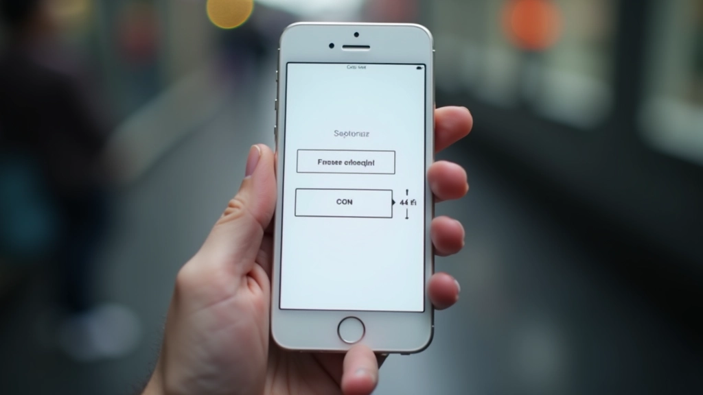
The 44-Pixel Touch Target Standard
This isn’t arbitrary. Human fingertips vary in size, but research shows that 4444 pixels (about 1010mm) is the minimum comfortable tap target. Below that, you’re asking people to be precise. During a crowded MRT ride, precision isn’t realistic.
Comfortable Interaction
A 4444 pixel button means accidental taps drop by roughly 30-40% compared to smaller targets. You’re also reducing frustration and increasing task completion rates. That’s not just good design—that’s good business.
Too many apps ignore this. They cram 6 buttons into a 280-pixel space. Users get frustrated. They make mistakes. They abandon the app. Simple math: bigger targets = better experience.
Putting It Into Practice
Design the Mobile Layout First
Start with a single column. Define what content matters most. Remove everything that doesn’t serve the mobile user. Only after you’ve solved mobile design, expand to tablet and desktop views.
Test With Real Users, Real Conditions
Don’t test on a desktop while sitting comfortably. Test on actual devices. Test in a crowded room. Test one-handed. Test while standing. Test with poor lighting. That’s Singapore’s real context.
Optimize for Speed
Mobile networks aren’t always reliable. MRT tunnels have dead zones. Design assuming slower connections. Every image should be optimized. Every interaction should feel instant. Speed is part of mobile-first design.
Prioritize Progressive Disclosure
Show only what’s essential. Hide advanced options behind toggles or separate screens. Let users discover deeper features only when they need them. Mobile screens are small. Make every pixel count.
Mobile-First Isn’t Just for Mobile
Here’s the thing about mobile-first design: it doesn’t just make mobile experiences better. It forces you to think clearly about what actually matters. When you design for small screens, every feature needs justification. When you design for touch, you’re being more intentional about interaction. When you design for scanning, your content becomes clearer.
Desktop users benefit too. They get cleaner interfaces, faster load times, and more focused content. You’re not designing two separate experiences—you’re designing one experience that adapts intelligently to any screen size.
In Singapore specifically, where commutes are long, time is scarce, and people expect frictionless digital experiences, mobile-first isn’t optional. It’s how you respect your users’ reality. It’s how you build products people actually want to use.
Ready to Rethink Your Design?
Start small. Pick one screen in your app or website. Redesign it with mobile-first principles. Test it. See what changes. Most teams are surprised by how much better things work when you stop forcing desktop patterns onto mobile devices.
Get Started TodayDisclaimer
This article provides educational information about mobile-first design principles and best practices. The statistics and guidelines presented are based on industry research and usability studies. Implementation may vary depending on your specific audience, technical constraints, and business requirements. We recommend testing all recommendations with your actual users before implementing changes to your production environment. Design principles evolve, and what works today may need adjustment as technology and user behavior change.